Saskatchewan’s professional lacrosse team will have a new look when the players take to the field for the team’s eighth National Lacrosse League (NLL) season in Saskatoon.
The Saskatchewan Rush unveiled a new logo on Wednesday, which the Rush said better represents the team, history and culture of the province.
“Once we returned to play after the pandemic, we conducted an evaluation of our brand and where we wanted to go in the future as an organization. One thing that stood out was our logo and how it didn’t really reflect our province and our home,” said Tyler Wawryk, vice president of team business operations.
“We feel our new logo is a strong representation of who we are as a team and also who we are.”
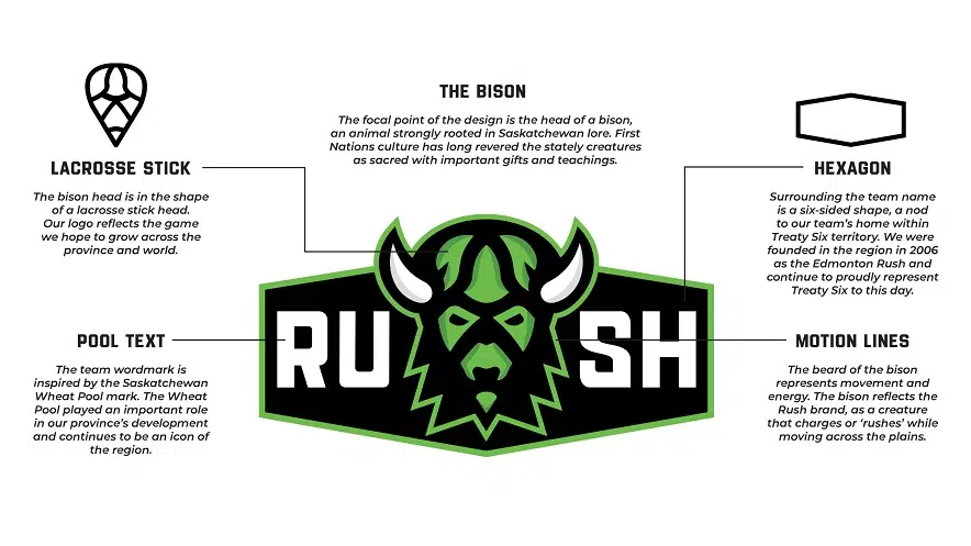
While the team colours remain the same, the crest was completely redesigned. The bison head and hexagon are a tribute to First Nations culture, while other elements were inspired by the former Saskatchewan Wheat Pool logo that’s still visible on grain elevators across the province.
The team said the old logos will be semi-retired, with brand new home and away jerseys coming during the upcoming season.
It’s the first logo makeover since the team relocated from Edmonton to Saskatoon for the 2016 NLL season.


